 Jekyll and Hyde; Acrylic
ETA: I have ran the scan through some filters so it looks a little smoother. Not as much detail, but it's a bit more reminiscent of the actual piece.
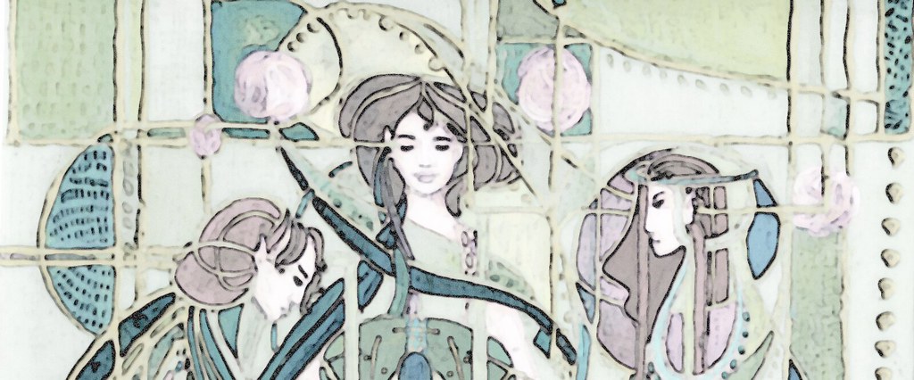
This is technically one of the older designs I planned, originally designed as a "masquerade" deco a while before I started the project. I would love to see that deco again!! Still hoping it makes it's way home one day-though if it hits a bunch of people like me it will take quite awhile...
After stabbing myself for the nineteenth time working on the crappy lino for The Coloring Song, I took a break and decided to move on to the painless though messy layers of this. I had to really kick up the contrast to get the image to show in the scan. It is very dark and murky in reality. Of course this also makes the brush lines very apparent, as well as the colour layers beneath. I attempted a pseudo-mische technique with transparent acrylics and gel medium. It worked to a certain degree as some of the layers lifted (so it looks particularly blue in places), so I guess true mische is the way to go for those of us who do not have WMRC in our homes to knock the piece to the floor in the week each layer takes to dry.
Anyway, between this one, The Colouring Song, and Stand I have my "quota" for the month. Heh.


