The Church, though dispersed through the whole world, even to the ends of the earth, has received from the apostles and their disciples this faith:
in one God, the Father Almighty, Maker of heaven, and earth, and the sea, and all things that are in them;
and in one Christ Jesus, the Son of God, who became incarnate for our salvation;
and in the Holy Spirit, who proclaimed through the prophets the dispensations of God, and the advents, and the birth from a virgin, and the passion, and the resurrection from the dead, and the ascension into heaven in the flesh of the beloved Christ Jesus, our Lord, and His manifestation from heaven in the glory of the Father “to gather all things in one,” and to raise up anew all flesh of the whole human race, in order that to Christ Jesus, our Lord, and God, and Saviour, and King, according to the will of the invisible Father, “every knee should bow, of things in heaven, and things in earth, and things under the earth, and that every tongue should confess” to Him, and that He should execute just judgment towards all; that He may send “spiritual wickednesses,” and the angels who transgressed and became apostates, together with the ungodly, and unrighteous, and wicked, and profane among men, into everlasting fire; but may, in the exercise of His grace, confer immortality on the righteous, and holy, and those who have kept His commandments, and have persevered in His love, some from the beginning, and others from their repentance, and may surround them with everlasting glory.
Irenaeus, Against Heresies Book I, Ch X
(isn't that sentence on the Holy Spirit just about the longest you've ever seen??)
Warning for Stan: Spoiler-if you like surprises in the mail, don't look any further. If you don't care or you're not Stan, go right ahead.
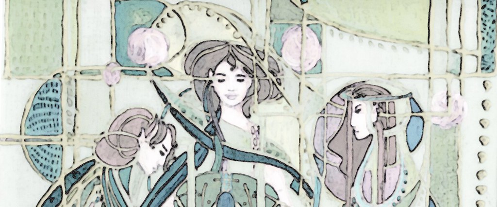
For those other two of you not in the know I have been working on a piece related to Athanasius for Stan for the last few months. It was designed at roughly the same time, and they were meant to be the beginning of a series.
Anyway because I am horribly lazy and fickle, only the two were ever designed, so I created this one for Stan in blue and copper/browns. It is a picture of Irenaeus, backed by Polycarp and lastly John (which I like to think is the Apostle just because I do and it makes the picture work). So it worked out like this:

The coppery lines across the faces is just the end of a thread I am using to quilt the background.
I still have that same old indigo vat. It freezes solid every year and every year I am surprised that it revives. I ran out of lye so it took an entire container of soda ash and over a week to balance the vat this time around, it was that acidic. But I did it-in fact the indigo gave the best colour I've ever gotten with it. I threw some silks and cottons in also at the time, with varying lovely colours. The colour is stunning and is a wonderful example of my earlier post on the luminosity of Natural dyes. I almost didn't want to paint over it. I darkened it with the tannin from some tea and it mellowed the colour and deepened it for a week or so afterward. This is another wonderful thing about natural dyes-surprises! The photo does not do the colour justice really.
Because the printer was being rather prickish in enlarging the image, I got to learn to make my very own projector from a shoebox, a camera lens, a mirror and a christmas tree light. It sort of worked-kind of. I don't want to do it again.
Here is the pen rendering of the design which was enlarged to become the pattern.

Because of the alkalinity of the vat (okay and because I could not find the noil I had used for Athanasius) I decided to use linen. While it worked out okay and I think that is the reason I got such a good colour, I don't think I'll use linen again. It started to pill as I scrubbed paint on there. The slubs also made an even layer of paint impossible. You can see the slubs and it isn't smooth like the application on Athanasius. It is also smaller, so there is less detail.
Except for those snags the paint went on okay. I am relatively okay with it.
I used the same pattern I had made in gesso for Athanasius to do the rubbing for the background. What can I say, I'm lazy.
I had a hard time deciding how I would add the words to the bottom, so I left it for awhile. Eventually I decided to do a rubbing so I used some old cerne relief paint that I had to pipe out the letters on a piece of paper and then rub over top of them with the copper paintstick. The piece moved when I went to do a second go over at the top, so the letters are not so clear there. I did go back and add some more paint in to render them clearer and some blue ink to make them stand in relief a little more. I actually like the deconstructed ancient look of the letters, even if they are likely quite difficult to read. It is the first part of the above quote that is used. I am thinking I might brown out the letters a little because as copper as they are now they are a little overwhelming.
I found a piece of dupionni that sort of mimicked the copper of indigo blossoms reasonably by being copper shot with blue. I decided to use it for the backing (it is not as orange as it appears in the photo because of the blue warp).
I've still got most of the quilting to do, but I don't foresee many snags there. I put the batting between the linen and the silk, and the edges of the silk are already finished and ready for hanging. Any day I don't have to do a binding is a good one. The linen is a little wonky, but I think it's livable. I'll update when the quilting is done, probably in the next few weeks.

ETA: Here it is with I think the quilting done. As you can see I unfortunately placed it a little crooked, but it hangs okay over all, better than I thought it might given the fact that the centre is so much heavier.
I should quilt the faces to contour them, but I am really wary of doing so. I might and I might not. The colours read truer on the first photo than on this one. Of course the silk is not so orange as it is in either.
Richard looked at it and said "Charlton Heston as John!" Okay so I guess it does kind of look like Charlton Heston. Haha. I hope you don't mind that Stan.
5 comments:
From the artistically-challenged, I'd say that's pretty good. From the engineering-gifted, I'd say that you definitely have the Knack. And nothing you say will fix that. So ha.
The word thingy is "exted," which should have something to do with signage and some old boyfriend named Theodore.
Yar. So that comment didn't go and I got a new one: barkist. Which has to be some kind of brewer of strange concoctions. Or someone like you, who makes dyes out of plants.
Char,
I was planning to wait until it arrives and be surprised but I couldn't stand the suspense.
It is beautiful! I can't wait to see it in person and see the richness of the colors.
Charlton Heston is fine with me. He's one of my favorites. I don't see the resemblance, but I'm colorblind.
love it. and the blog. very nice, all of it.
Stan, my brother said it looked like Charlton Heston so you'll have to take it up with him.
Thanks for the kind words Matthew.
Wow on my brother's monitor this looks AWFUL. If it looks really light toned and ugly on your monitor, that is not what it looks like in real life! EW.
It's here!!! Came yesterday.
Beautiful! Absolutely beautiful!
I wish I weren't colorblind so I could see all the hues that are there. However, the ones I am seeing are wonderful! You're a genius. Brilliant!
Post a Comment