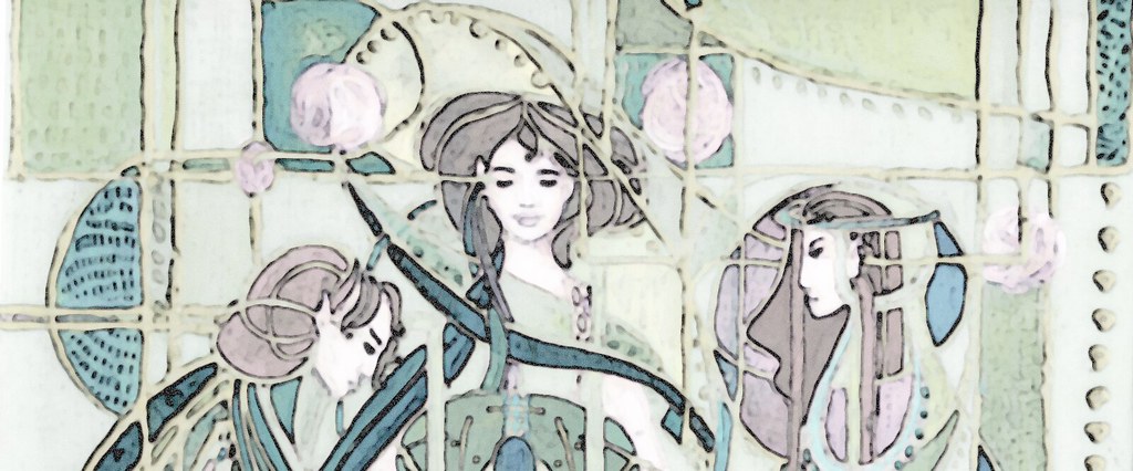
 Another Deco! For a 'true colours' challenge, which stipulates using a very narrow palette-one or two colours. I blurred the image abit to take some of the paint lines off, but it looks a little weird from that, doesn't it?
I was looking over my artwork about a year ago, and noticed how often I used red and blue-I've since tried to move away from it. See the fabric and paper deco for an out-of-comfort-zone colour combination.
However, since these are still my favorite two colours and favorite combination I entered the challenge just for the pleasure of using it again! :)
I used a photo of myself, and altered it to get the high contrast and so on. Then I painted from that with acrylics-went a little wonky though. Ah well, I think it turned out okay-except that my nose doesn't look sausagey enough.
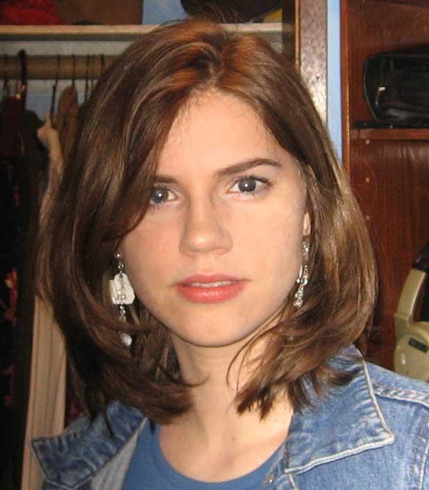
ETA: here is the original picture (yeah I always look weird in pictures) see the distinctly sausage-like quality of my nose-->
short and fat.
7 comments:
Are you kidding???? You're BEAUTIFUL!!
I don't know, I never thought sausage noses were very beautiful...heheh
Thanks though. :)
Well, it's better than having a hamburger for a nose. ;-) Just kidding. I honestly can't see the "sausage schnauze," but I just had to say something. ;-)
Char - What a gorgeous picture! Can you tell me the process you went through to create it? I'd love to play around with some photos and get similar results (anywhere near as good would make me happy). Thanks for posting this.
BTW - You ARE somebody. I found you through Pyromaniac.
LOL, Richard D. I didn't realize you had commented until just now, but I'll take you through my process anyway.
I took the loverly sausage shnauze pic (thankyou for that term pchan), opened it in photoshop and applied the paper cutout (or some such name) filter. Then I raised the contrast on the photo very high, and I believe I fiddled with saturation as well. I set my background colour to blue and foreground to red, and then applied the graphic pen filter. Of course I fiddled with them all a little to get the look I wanted.
My final step was to actually print it out, trace the image and paint it with acrylics. So the finished image is not really a digital manipulation of the photo (though it looks quite close to it), but a painting of a digital manipulation of the photo. Which I digitally manipulated even more, by applying a blur filter. Whew! Hopefully that made sense.
I tend to take a half-traditional half-digital medium approach more and more these days.
You're awesome char, an outstanding artist. I'm going to try playing with some photos the way you described here and see what happens. If I manage to create something that doesn't totally offend the sensibilities of the viewer I'll let you know.
BTW - I HATE skinny jeans too (I know, that's another thread, but I'm lazy)
really awesome sist.. :)many thing I got from Your posts. these all made me increase my imagination.
Post a Comment